
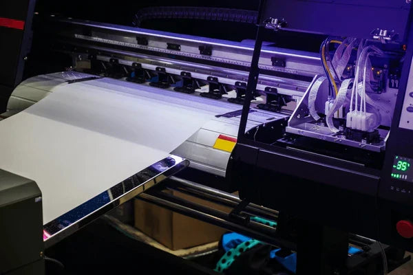
Understanding the problem: faded colors with new ink
One of the most frustrating experiences in digital garment printing is watching a freshly printed film come off the press looking pale, washed‑out or gray, even though you have just replaced the cartridges. At DPI Supply, our team has learned that the culprit isn’t usually the ink – it’s the process. In direct‑to‑film printing, color vibrancy depends on how well the entire workflow is tuned, from the image file to the final press. Small oversights in curing, film quality or printer maintenance can produce muted results despite brand‑new cartridges. I’ll share what we’ve learned, backed by industry research, to help you get the rich, saturated hues you expect.
Why is my printer printing faded but new ink?
The first reaction when colors appear flat is to suspect the ink itself. However, poor color often stems from clogged or partially blocked nozzles that restrict the flow of DTF Inks. White ink, with its heavy pigments, settles quickly and clogs more readily. If even one channel in the printhead is blocked, the underbase becomes thin and every color printed on top loses its pop. Daily nozzle checks and agitation of white ink prevent sediment from settling and ensure a consistent underbase. High‑quality Digital Printing Inks are designed to flow smoothly, but they can’t overcome a blockage.
Another overlooked factor is the design file. Designs exported in RGB mode may look vibrant on a screen but print dull on a CMYK printer. Low‑resolution artwork (<150 dpi) or poorly saturated designs also translate into faint prints. Always prepare artwork in CMYK (plus white where applicable) at 300 dpi or higher, and avoid over‑compression when saving files. A clean file ensures that your DTF Supplies work at their best from the start.
Why is my DTF printer not printing vibrant colors?

Vibrant color reproduction relies heavily on accurate color management. Many print operators forget to load the correct ICC profile for their ink and film combination. Industry guides note that using a generic profile or an incorrect color space leads to misaligned colors and dull tones. A custom profile calibrates your printer to your specific DTF Inks, film and powder, ensuring that screen colors translate precisely to fabric. Calibrating your monitor also helps you see what will actually print.
Film quality is equally important. Low‑grade PET films often have uneven coatings and poor ink absorption, causing colors to appear faded. Opt for premium film that provides uniform ink lay‑down and good powder adhesion. Cheap powders can also compromise vibrancy; reputable hot‑melt powders melt evenly and bond cleanly to fabric. When you combine high‑quality DTF Supplies with the right ICC profiles, you set the stage for rich color output.
Printhead clogs and air bubbles
Printhead maintenance is the backbone of consistent color. White ink has a high pigment density and will settle quickly, leading to clogging. Long idle periods, low humidity or incompatible ink formulations accelerate this process. Running daily nozzle checks, shaking white ink before use and performing light cleanings help avoid clogged nozzles. Maintaining ambient humidity between 40 % and 60 % prevents ink from drying inside the nozzles. A stable environment also reduces the risk of air bubbles entering the dampers, which can cause sudden banding or color dropouts.
If you notice broken lines in a nozzle check, perform a cleaning cycle before printing. It’s better to spend five minutes on maintenance than to waste film and ink on a dull print. In some cases, air can get trapped when replacing cartridges. Letting the printer sit idle for a few minutes after installation allows the dampers to fill completely. By prioritizing maintenance, you ensure the new Digital Printing Supplies have a clear path to the media.
Keep your workspace balanced
Environmental factors influence both ink flow and curing. Low humidity dries ink prematurely, while high humidity causes moisture to absorb into the film or powder. Keep your production area at 20 – 25 °C (68 – 77 °F) and a relative humidity of 40 – 60 %. Use a humidifier or dehumidifier to balance extremes. Also, keep powder and film sealed when not in use and avoid touching the coated side of the film with bare hands; oils and dust create adhesion problems that lead to dull spots.
ICC profiles, color modes and design considerations
Color profiles translate digital artwork into printed ink values. If the RIP software uses an incorrect or generic profile, colors can shift, appear oversaturated or look muted. Make sure your software is set to CMYK + White and the ICC profile provided by your ink or film manufacturer. When designing, work in the proper color space and avoid extreme transparencies or gradients that vanish on dark fabrics. Some printers allow you to adjust ink limits; increasing ink saturation slightly can boost vibrancy without causing bleed, but test small swatches first.
Another common oversight is forgetting to apply a white underbase on dark garments. Without a solid white layer, colors sit directly on the black fabric and look muted. Ensure that your RIP applies the white ink layer beneath CMYK channels. For detailed designs or small text, consider printing at 1440 dpi instead of 720 dpi to improve definition and color density.
Curing and heat press settings: getting the heat right
After the film is printed and powdered, the curing process melts the hot‑melt powder and encapsulates the ink. Under‑curing—where the powder doesn’t fully melt—results in a gritty texture and dull colors. Over‑curing can scorch the powder or cause it to crystalize, which also dulls the print. According to best‑practice guides, aiming for 160 – 180 °C (320 – 350 °F) with an even heat distribution produces a glossy “orange peel” look that indicates proper melting. Use an infrared thermometer to verify your oven’s temperature rather than relying solely on its built‑in gauge.
When it comes to the heat press, time, temperature and pressure must work together. Insufficient heat (<150 °C) or too short a pressing time (<10 seconds) results in weak adhesion and faded colors. Uneven or low pressure leads to patchy transfers and washed‑out areas. Here is a quick reference table that you can tape beside your press:
| Step | Temperature (°C/°F) | Time (sec) | Pressure | Purpose |
|---|---|---|---|---|
| Powder curing | 160–180 °C / 320–350 °F | 2–5 min (oven) | N/A | Melts adhesive powder until glossy |
| First press | 150 °C / 302 °F | 10–15 | Medium–firm | Transfers ink to garment |
| Second press | 160 °C / 320 °F | 10–20 | Medium | Seals the print and improves wash fastness |
Always let the print cool before peeling the film. Premature peeling can lift the ink and leave a foggy residue. Some films require a cold peel, while others are hot peel. Read the manufacturer’s instructions and adjust your technique accordingly.

Material quality and environmental factors
The quality of your DTF Supplies has a direct impact on color vibrancy. Inexpensive films may have uneven coatings or poor release properties, causing colors to bleed or appear faint. The adhesive powder should melt evenly; low‑quality powder can clump, burn or fail to bond properly. Choose branded film and powder designed for the inks and fabrics you’re using. Many suppliers offer sample packs so you can test before committing to a bulk purchase.
Environmental stability is just as important. Temperature swings affect curing and ink flow, while dust and lint create small voids in the transfer that show up as faded dots. Keep your workspace clean, use lint‑free cloths to wipe down surfaces, and store film flat to prevent curling. Running an air purifier helps remove airborne particles that could land on your transfers. These small practices ensure your high‑quality Digital Printing Inks aren’t compromised by their surroundings.
How to make DTF prints more vibrant?
Increasing color vibrancy is about optimizing each step rather than dumping more ink onto the film. Start by ensuring your artwork uses saturated hues that fall within the printable color gamut. Properly shake and circulate your white ink so the underbase is opaque and even. Then fine‑tune your RIP’s ink limits to push a little more CMYK without flooding the film – a practice that requires testing but yields noticeably richer colors.
Next, verify that your curing equipment reaches the correct temperature and that your powder melts uniformly into a glossy finish. Uneven curing results in patchy adhesion and muted tones. Finally, press with consistent pressure and time. A second post‑press at a slightly higher temperature helps fuse the ink deeper into the fibers, enhancing wash fastness and saturation. For more tips on boosting vibrancy, you can read our detailed guide How do I make my DTF print more vibrant?.
How to fix faded color on printer?
When you encounter a dull print, diagnose systematically. Begin with a nozzle check; missing lines indicate clogging. Perform a cleaning cycle, shake your white ink and run a test print. If the printhead is clear, examine your design file: Is it in CMYK? Does it have a proper white underbase? Next, verify that the correct ICC profile and ink limits are loaded in your RIP. Mis‑matched profiles are one of the leading causes of muted prints.
If your software settings are correct, move on to the physical process. Check that the powder was applied evenly and cured at 160 – 180 °C until glossy. Use an infrared thermometer to confirm the actual temperature of your oven or heat press, as many units deviate from their display. Finally, assess your pressing technique: medium pressure and a full 10–20 seconds are critical for a strong, vibrant transfer. Making these adjustments usually resolves faded prints without changing inks.
Preventive maintenance and workflow tips
Regular maintenance prevents most DTF issues before they impact your work. Industry checklists recommend shaking white ink and specialty inks daily, running a nozzle check before printing, and keeping the printhead and capping station clean. Weekly tasks include light printhead cleanings, inspecting ink lines for air bubbles or sediment, and verifying the accuracy of your curing equipment. Before any print run, confirm that the correct ICC profile is selected, the ink and film are compatible, and the environmental conditions are within range. After curing, inspect the film for even powder melt and adhesion, then test on scrap fabric before pressing the full batch. These habits take minutes but save hours of troubleshooting and wasted materials.
A personal story from DPI Supply
Early on, we once pressed a batch of prints for a local athletics club. Everything looked perfect on the film, but the finished shirts came out dull and chalky. Frustrated, we ran through our checks and discovered that the oven thermometer was off by nearly 20 °F. Our adhesive powder had never fully melted. After recalibrating the oven and adjusting the press pressure, the colors on the next run were bold and consistent. That experience taught us that even small oversights like a faulty thermometer can ruin a print job.
Turning problems into vibrant prints
Achieving vivid, durable DTF prints is a holistic process. New ink alone won’t solve muted colors if the printhead is clogged, the ICC profile is wrong, or the powder is under‑cured. By maintaining your printer, using high‑quality DTF Supplies, controlling your environment and dialing in your curing and pressing settings, you’ll consistently produce vibrant results. Remember that each component of the workflow—from design to final press—contributes to color fidelity. Invest time in setting up your system properly, and those brand‑new cartridges will reward you with prints that pop.
